We recently revamped our eNewsletter to make it more attractive and useful — for you, certainly, and for us in that the software reports how many times each item is clicked, helping us to better program the piece going forward. Here’s how the early returns are shaping up for the issue shipped this week. Count is expressed as a percentage of all clicks, rounded:
Tom Donnelly Video 21%
First Snowfall Video 21%
Haverblog Main Page 21%
Nobel Prize 7%
Iron Chef 6%
Special Olympics 4%
AIDS Quilt 3%
18 in 08 Film 3%
Literary Magazine 3%
Haverford Fund 3%
Treasure Island 2%
Bronze Casting Video 2%
Art Show 2%
News Page 2%
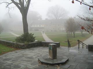
Looks like people go with what (or who) they know and for the newsletter’s audience, it doesn’t get much more familiar (and beloved) than Tom Donnelly and the first snow on Founders Green. Notably, those top entries were displayed low on the eNewsletter’s page, echoing my experience formatting Philly.com: people scan for appealing links, location on a page be damned. It’s almost as if perusing a web page taps into the same part of our brain that Neanderthals used in scanning the forest for glints of light and shadow and their associated message of “I will eat that/that will eat me.”
-CM